
Let’s touch on the Flyers quickly before we get into non-Philly stuff. The bullies have acquired center Trevor Zegras in a trade many are applauding. Zegras is no stranger to wearing orange and black, as he played for the Anaheim Ducks since the team drafted him in 2019. This is exciting news for a team desperately in need of some. I’ll update when you can start picking up some TZ merch at a store near you (does he go by TZ? He should).
The St. Louis Blues Introduce a Refreshed Look
Now let’s dig into some meaty Flyers-adjacent news. And get ready for some gushing because I love a blue and gold color scheme. The St. Louis Blues on Tuesday introduced a refreshed look for the upcoming 2025-26 season. The elements retain the team’s classic features while introducing changes that really make the look pop. Let’s break down each new element:
Logos
source SportsLogos.Net
The Blues used essentially the same flying music note as their primary for nearly 27 years (left). The new logo (right) simplifies the overall design, fixes line width inconsistencies, and relays a greater sense of motion. The image now looks like its moving “faster,” and the new positioning of the note also balances the whole thing out. I’m also a fan of how the lighter shade of blue looks overall. They improved upon what was already a classic logo. Primary logo: A–

I guess I never realized the fleur-de-lis was so closely tied to St. Louis but upon inspection… yep it’s featured very prominently on the flag. The Blues clearly wanted to remind us that New Orleans shouldn’t get to hog it, because they added a new iteration of the symbol to their arsenal. The ‘Fleur’ infuses the iconic shape with a treble clef, tying it back to the team name. Plus we see the music note appear here again. It’s a clever way to combine three simple yet meaningful shapes to create something entirely new. ‘Fleur’ logo: A
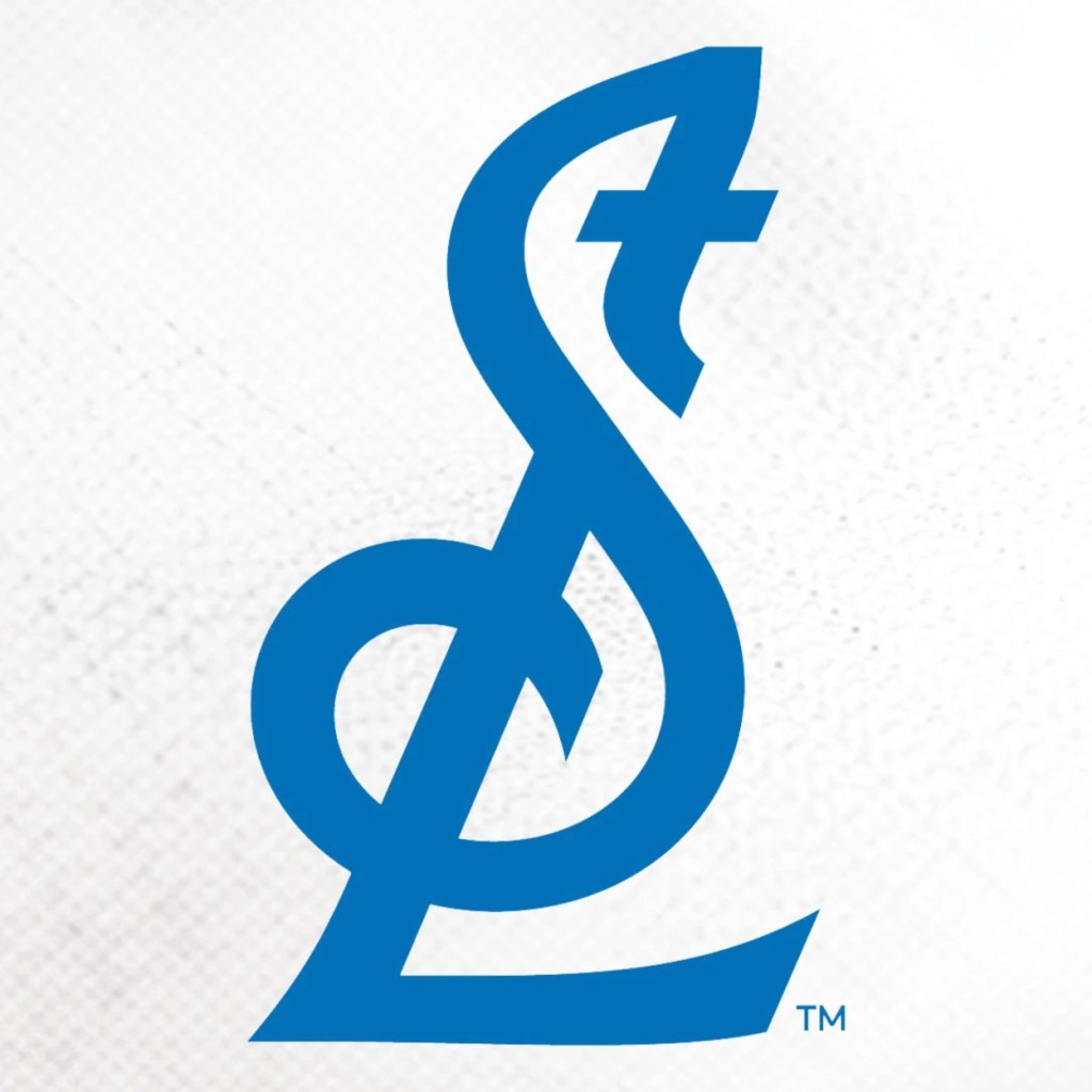
Another completely original and visually appealing logo from this Blues reveal. Here we see city initials “St.” and “L” come together to form another treble clef. And while technically the treble element is facing the opposite direction this time, I’m again in awe of how effective an simple this is. It looks great on a hat, too. ‘STL’ logo: A
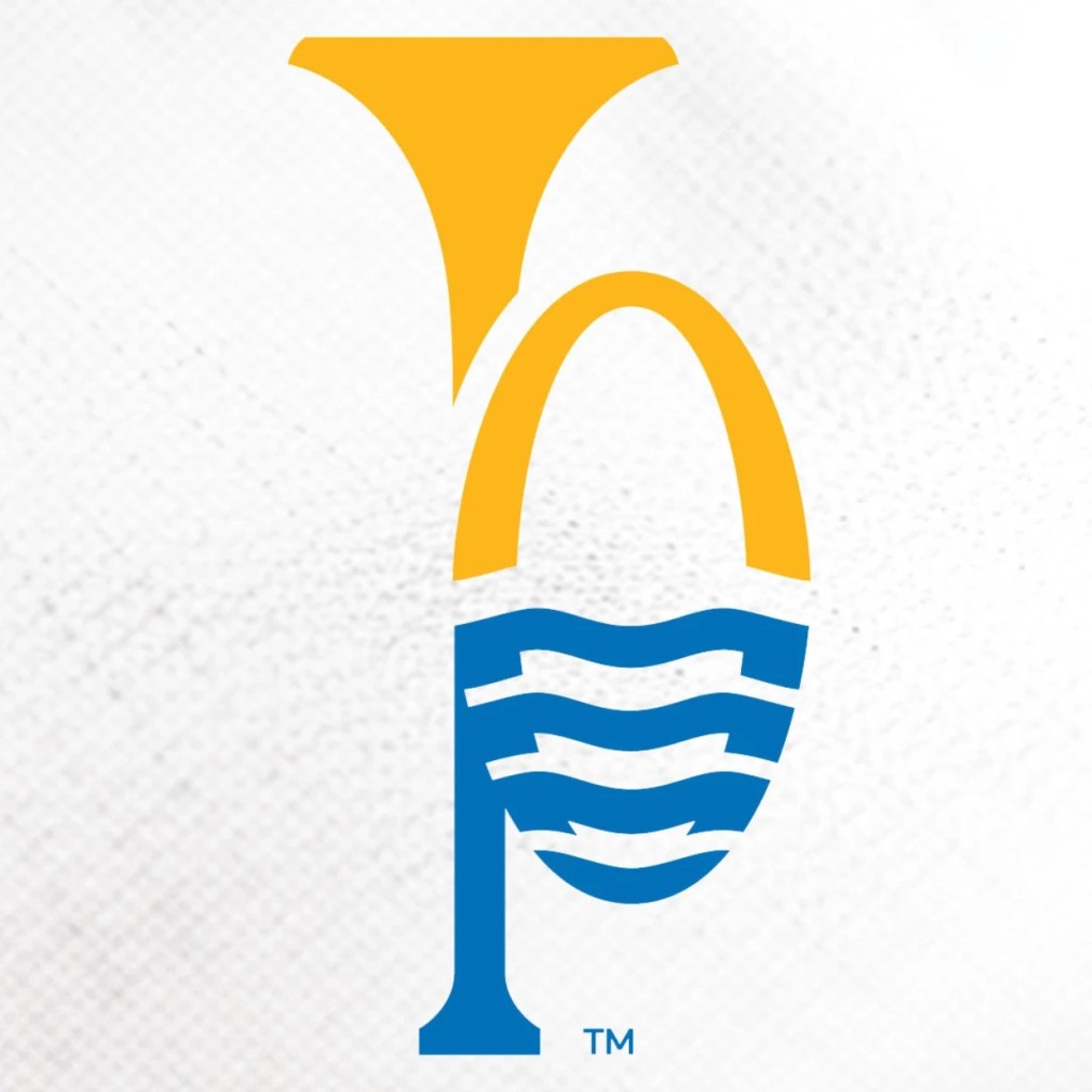
The Blues keep the momentum rolling with another eye-catching secondary mark. Per the Blues’ website: “The iconic Gateway Arch, reflecting in the Mighty Mississippi, come together to form a trumpet that pays tribute to the historic music scene of downtown St. Louis.” I really like this logo, but unlike the other two it’s a little unbalanced as there’s a lot going on. For some reason it screams “Visit St. Louis,” like it should be on a brochure. I still think it’s super creative and would love to see how it’s implemented. ‘River Music” logo” B-
Wordmarks
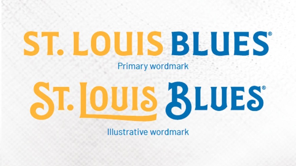
Look, I told you guys this would be a gush-fest and that’s not stopping. The primary wordmark looks fine. Although simple, it still has more personality than what a lot of teams have adopted these days (*cough*Flyers). But its what the team calls the “Illustrative Wordmark” that really shines here. The type was inspired by W.C. Handy’s St. Louis Blues sheet music, and evokes the feeling of riding a riverboat down the Mississippi river. I’m speechless, they went all out for this. Primary wordmark: C+, Illustrative wordmark: A+
Jerseys

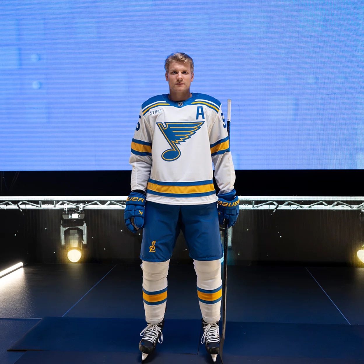

The Blues round out their new look with new home (left), away (top right), and third (bottom right) uniforms. For comparison, their new thirds seem to just be the home jerseys they’ve been wearing as of late. So they still get to keep what was already a nice look in their rotation.
As for the new set, I’m a bit torn. Both look nice, but I wish they were consistent swaps of each other. The home look ditches the yolk and keeps it simple, but it just feels like something is missing at the shoulders. Maybe I’ll change my mind once I see them in action, but I prefer the design of the third jersey as of now. Home jerseys: C, Away jerseys: B+, Third jerseys: A-
——————————————————————————————————Overall, I think it’s clear to say these are winners. For me. they incorporate some of my favorite aspects of sports design: simplicity, meaning, and a blue/gold color scheme. The design team clearly did their homework and really showed off here. Kudos to the organization for something that both looks good on the ice AND reps the city so well.
That’s it for this non-Flyers hockey breakdown! What do you guys think of the Blues’ new look? And stay tuned, because another NHL team might be making an announcement very soon…

Leave a comment